By Joshua Hunt and Matthew Boffey
Typographic hierarchy helps the reader know what is most important. By grouping type into clearly defined visual categories, you organize the page for clear communication.
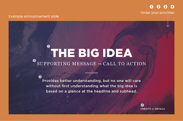
The example above follows the basic guidelines of typographic hierarchy:
- Have only one big idea, and let it shine.
- Have just one supporting message or action (and only if needed).
- Have four or fewer hierarchical categories. Ask, “What can be cut?”
- Arrange priorities from top to bottom.
- Set type sizes according to priority (biggest font up top).
- Use just one or two fonts.
- Reinforce priorities with bold, serif/sans-serif, and title/sentence casing.
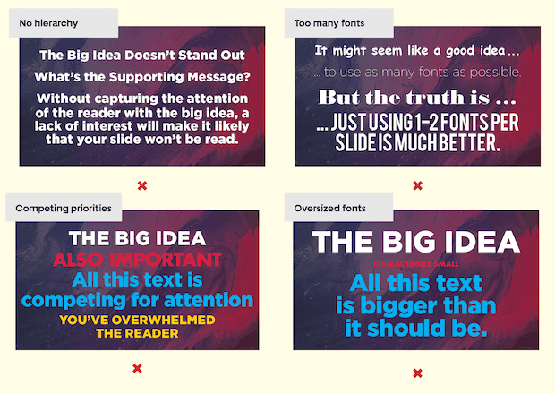
4 common mistakes to avoid
- No hierarchy
- Too many fonts
- Competing priorities
- Oversized fonts
Use color from the background image
In Version 1 below, the type already has a clear hierarchy from the font size and weight. In Version 2, the title pulls in the dark brown from the sand (same tone, different value) and the subtitle is lighter.
Version 1

Version 2

These simple changes will help you achieve a tighter, more unified design.


