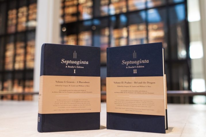
We are immensely privileged to feature perhaps the most exciting new book project to come to light this year, Septuaginta: A Reader’s Edition. This immense 2-volume work, edited by Gregory R. Lanier and William A. Ross, is jointly published by Hendrickson Publishers and Deutsche Bibel Gesellschaft and will certainly be an invaluable resource for many generations of students, pastors, and scholars for years to come.
In the following interview with William Ross, we discuss the creation of the Reader, technical aspects of the design, and what’s in store for LXX studies in the future. If you’re in Denver right now for ETS/SBL, now’s the time to get your copies.
TB: What were the circumstances that led to you being involved with this project and ultimately seeing through?
Basically the circumstances that led to the project came about when Greg and I returned from SBL 2014 with the same idea. We had both seen the new Hebrew reader’s edition by Hendrickson and been really impressed with it. It must have planted a seed, because both of us independently thought, “Why isn’t there one of those for the Septuagint?”
A few days before Christmas, I got an email from Greg that said this:
“Hey man, is anyone working on an LXX ‘readers edition’? And if not, why not us? Not joking. I’d buy that in a heartbeat.”
My response was:
“Greg, this is a fabulous idea. So fabulous that I thought of it myself ????. But seriously, yeah. I did think of this at the conference when I was leafing through the new bhs reader at SBL . . . I am 100 percent in. No idea what it would take, but if we don’t do it someone else will.”
That’s how it started.
The next logical step was to think about who would publish it, what it would look like, and how we’d pull it off. We submitted a full proposal with sample texts in January 2015, and were underway that spring. Hendrickson was an obvious choice for us—considering the quality of their Bibles and their relationship with the German Bible Society, who own the rights to the Greek base text we used.
There is a ton to say about seeing the project through, both in workflow and general, teeth-gritting consistency. It took us three-and-a-half years of almost daily chipping away.
That was very entrepreneuring of you both, to say the least, and your response opens up a number of questions. First of all, though, I have to agree that you were right to choose Hendrickson. The physical and aesthetic quality of the two volumes is astounding, and each time I pick them up to read, I am locked in this tension between wanting to simply appreciate the fine attention to detail of things like fonts and binding, and the serious work of actually reading one of the greatest treasures possessed by the Church, the LXX. But that said, why would anybody want to own these volumes when they can simply read the Greek Bible on their computer screen, or pick up their tattered copies of Rahlfs and Lust? What’s the real value in owning (and presumably using) your Reader?
On a general level, I think a lot of people are realizing that society is overwhelmed by the ever-present Screen as a form of media. The blind optimism that the computer and internet would improve every aspect of our life and work is less and less common, and rightly so in my view.
Among established biblical scholars, many are remembering (or recognizing for the first time) that being able to search a text digitally is not at all the same as refined competence in an ancient language or close familiarity with its content and related literature. Maybe it’s just because I am still (relatively!) young, but I also think students and other young scholars in particular want to take a break from the constant digital glare and sit down with a well-made physical text for sustained reading. Greg and I certainly do.
There have been many occasions when I’ve told a mid- or late-career biblical scholar about the Reader and they don’t even understand the concept. In most cases, that’s because they have never once thought of either (1) failing to read the primary languages regularly or (2) doing so on a screen. They simply use the standard critical editions, plus lexicons and grammars, and always have. But younger scholars and students usually are not so. We have had our biblical language training minimized in the curriculum or de-emphasized in our coursework owing to pressures in higher education to trim hours or accommodate students. We feel—and often are—less well equipped than we want to be.
Greg and I see many among the younger generation in biblical studies working very hard to improve their language skills, often through sustained reading that is as efficient as possible but ditches the screen. I would suggest that’s why we’ve seen greater interest in high quality reader’s editions and other language tools in the past decade.
Is it true that you completed this project simultaneously with finishing your doctorate and doing family life? Tell us a bit about the specifics of your daily workflow so we can understand how you were able to pull this off.
Yes, it’s true that Greg and I were both in our doctoral programs when we began the project (and have families). We also each had a number of even more complicating circumstances during the project. in that Greg graduated and moved back to the States to begin teaching, and I had an incredibly intense family health crisis.
Commenting for myself at least, the Reader was actually a great project to have in certain ways because it was so flexible and discrete. All we needed to work on it were our laptops and an internet connection. Producing or proofing a chapter could be done in just a few minutes in some cases, though others took upwards of an hour. But my point is, it was the kind of project that could slot into almost any amount of time, virtually anywhere, and which did not really require sustained mental attention in the same way that developing a detailed argument in prose does.
Personally, I produced a lot of my half of the reader in a hospital room in California. Once some stability returned to my family life (thanks be to God) and I returned to my doctoral research in Cambridge, my work flow was pretty simple. I do my own language reading in the early morning before breakfast and keep everything else mostly to business hours. Usually I would either work on the Reader for an hour at the beginning of my work day, and then for an hour or so after the kids were in bed at night. So I’d typically log about 10 hours a week, for three years or so. Otherwise, I focused on my doctoral research or other academic work. So the project was actually fairly contained. The biggest challenge was consistency and endurance in changing circumstances.
If I had seen these volumes as a seminary student, I would have had two reactions: first, I would have sold my car to get a copy; and second, I would have been frightened to open them, not knowing where to begin. Do I open Genesis and read straight through? Should I start somewhere “easy,” like the Psalms (they’re easy, right?). And although using a reader might seem intuitive, are there “best practices” for these things?
Glad you like how they turned out! We are also extremely pleased. I get this same question about where to start a lot, actually. As it happens, “the beginning” is a perfectly good place, since the Greek Pentateuch is actually pretty manageable from the perspective of NT Greek. The Historical Books and Psalms are also worth trying out. Although I can’t go into any real detail, I’ll add that Greg and I are currently working on a complementary spin-off project that will significantly help with reading the Septuagint, and we are mulling other ways to help make the corpus accessible.
As for best practices, that really depends on what you want to accomplish and where your Greek is at the moment. My guess is the hardest thing for most readers will be vocabulary rather than syntax. So one recommendation I would give is always trying to work out the meaning of a given word in context before “peeking” at the footnote.
It turns out that a lot of the non-NT vocabulary in the Septuagint includes words that are closely related, even as simple as a compound verb like ἐκπορεύω. So in many cases, context is sufficient. Plus, trying to work out the meaning of unfamiliar words this way forces you to actually pay attention to what is happening in the text from a content standpoint, which takes a different (and beneficial) kind of focus and processing.
Let’s talk about design elements [as this post will be featured in the Design Showcase series]. Talk to me about font, paper type and weight, binding, cover design and construction, and how font/readability issues factored into the decision to make two volumes.
There were a lot of design challenges and decisions for the Reader, most of which were spearheaded by our editorial team at Hendrickson, though Greg and I were involved at most points as well. We’re really pleased with how it turned out overall and we hope readers will be also.
The font for both the English and Greek text is Minion Pro, which is a humanist font similar to what was commonly used in the Renaissance era that is growing in popularity among contemporary publishers. It has excellent legibility and a sophisticated look. We experimented with different point sizes for the main text and footnotes, which was a balancing act in terms of striking the right ratio of footnotes to a page with a user-friendly font point size. Of course, no matter what font we decided on, a book of this length would inevitably be unsuited for binding in a single volume in terms of durability and practicality. The decision about where to put the volume break was based on the 1935 edition of Rahlfs, which was itself issued in two volumes by the German Bible Society: Pentateuch and Historical Books in volume 1, and Poetical and Prophetic Books in volume 2.
As for the paper, it’s somewhat thinner than standard book paper, but still on the thicker side as far as your typical Bible papers go (50 grams per square meter). It’s a cream white with high opacity, meaning it has minimal bleed-through compared to other books of similar length, which was a top priority for us.
The Reader comes in two bindings: (1) blue cloth hardcover and (2) black flexisoft. We wanted to provide two choices since, for products of this size and price point, people have different preferences. Both are durable in terms of the cover material and stitching, which is done with the high-quality “Smyth-sewn” technique. These volumes have been designed to hold up for years of (hopefully daily!) use—and with that in mind, we also opted for two ribbon bookmarks in each volume.
The cover was done by one of the Hendrickson graphic designers, with input from others to determine the final look. The goal was to make a cover that fits well with the minimalist, classical aesthetic typical of other books published by Hendrickson and the German Bible Society.
Who is the ideal user of the LXX Reader? Do you think a lot of seminary students will want to get their hands on this, or is your ideal market pastors and scholars?
Well obviously we hope that the Reader will be useful to a wide range of people. In a significant way, the reader we had in mind—while we were coming up with the vocabulary thresholds and other design features—was the student of biblical studies, specifically New Testament Greek. These aren’t only seminary students, but others at the graduate and even undergraduate level who have worked through a NT Greek course.
At some point, to continue to grow in your knowledge of the language, you have to step outside the NT corpus. That can be very intimidating for a lot of people. So we wanted to lower as many barriers to entry as possible for the Septuagint, which is challenging in different ways, but which should otherwise be a very obvious candidate for your reading choice. Of course, every pastor was at one point a student, so while we hope the Reader can provide a student resource to help build good habits for the future, we also want to help pastors return to the language they once studied as a student.
At the same time, there are plenty of other readers who will benefit. We hope teachers and scholars of all kinds in biblical studies will pick these up and use them. Septuagint is becoming a slightly more common corpus of study among Hellenists as well, so we hope scholars in that discipline and even in classics will find the Reader useful.
LXX studies currently is quite a small discipline relative to NT and OT studies proper (although both camps like to sneak the LXX when it’s convenient). Do you see this resource generating greater interest in the LXX as a topic of study and research in its own right, or is the Reader intended more for personal study and devotion of the Bible in Greek?
I think it will do both. I have a hard time thinking that students and scholars who are reading the Septuagint on a regular basis wouldn’t bump into interesting things for further research. It happens all the time in my experience. If nothing else, though, the perplexing aspects of the language of the Septuagint and the way it compares and contrasts with the Masoretic Text will, I imagine, tempt readers into picking up an introduction to the discipline to learn more.
Obviously, though, the Septuagint isn’t only made up of linguistic curiosities and oddities. Most of it is simply a comprehensible Greek translation of the Hebrew Bible. So to that extent, it is definitely a corpus you can read for personal devotion or other spiritual formation. Saying that doesn’t make any claims about its authoritative status. It simply points to the fact that, like any translation of the Hebrew or Greek Scriptures, the Septuagint communicates meaningfully about spiritual realities.
What would you change about the design of the LXX reader as it stands currently, if you could? Should we be expecting a goatskin leather cover edition in the near future? Maybe camel skin with a zipper cover?
????
No really; I would buy that.
Personally I would love to see a Large Font Archaeology Journaling Edition.
In all seriousness though, I think both Greg and I are very satisfied with the result, and I can’t think of many changes I would make. I know I have had a few people ask whether there would be any top grain bindings or a single volume edition in the future. I don’t think either of those are going to be on the horizon any time soon (if ever). But you never know.
We have done some planning for improvements however. We have already launched a page on our Reader blog for users to log errata if they find any. If you do that you are entered into a drawing for a free copy of the second (corrected) printing.
Thanks, Will. It’s been really good chatting with you about this incredible resource and the design elements you and Greg implemented to bring it to market. I look forward to the camel-skin version.
Many thanks to the British Library for the perfect location to shoot what will prove to be an indispensable resource for generations of students and scholars to come.
Photos by Tavis Bohlinger.


